Ripple Design System - Revv AutoCare
About Revv’s ripple design system
We were building an auto management system for auto shops, developing solutions to the challenges autoshop owners experienced; enterprise solutions. We recognized the complexity of this endeavor. Keeping up with the pace of deliverables and the industry. We set out to reshape the way we work, unlocking the boundless potential of their ideas and enhancing cohesive and consistent output.

Highlights

Approach to Ripple
I took a structured approach to developing this design system adopting an Atomic Design methodology by Brad Frost.
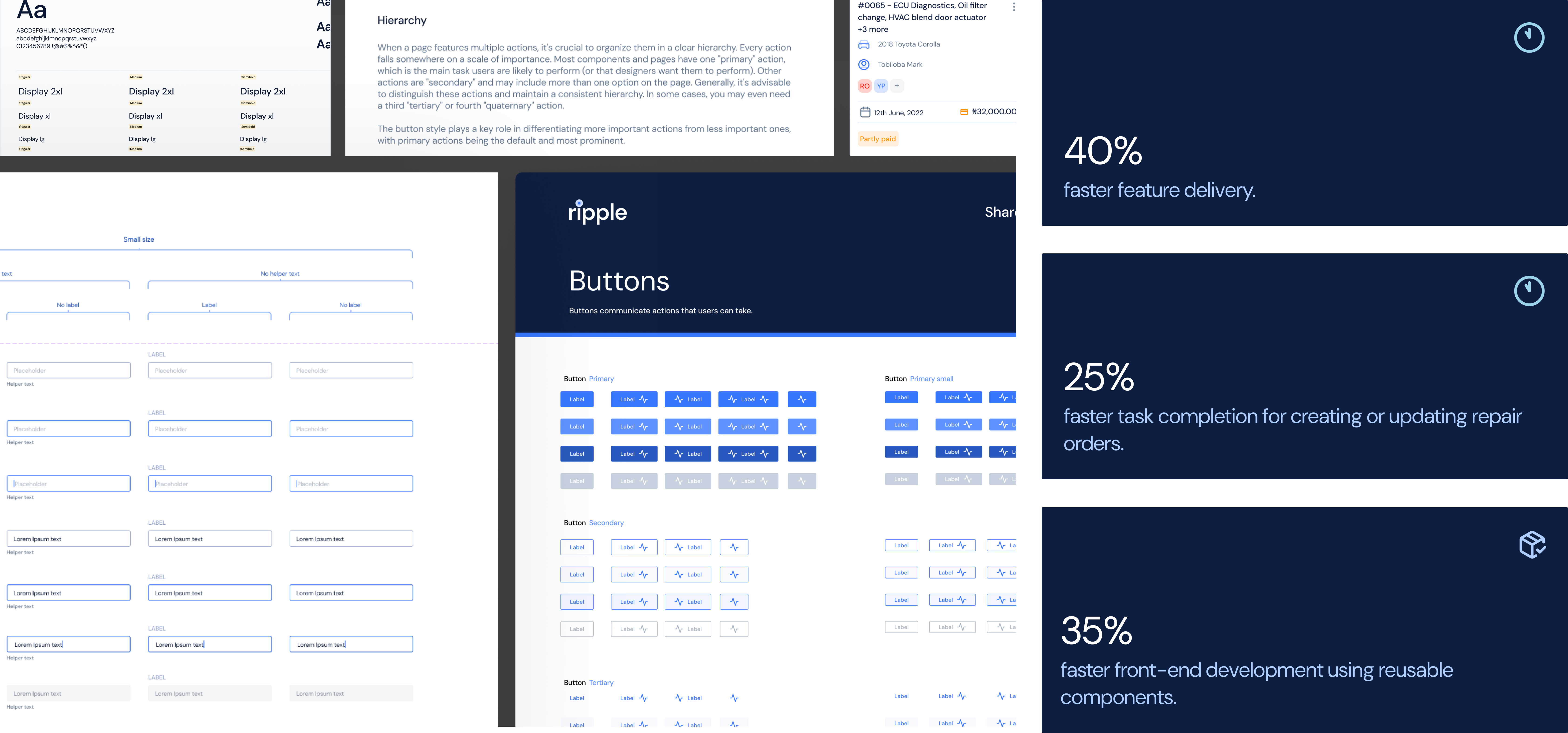
Starting out with the foundations(Atoms): I defined the color palette, typography, borders and shadows, which were partly informed by the brand identity


Some core principles we kept in mind during this process
User Centricity - We want to ensure that every interaction our users have with our product is a positive one and solves for something, thereby building a strong connection with our brand or product across platforms
Simplicity - We deliver delight and satisfaction through a clean and focused experience every time. By relying on existing, common design patterns that are intuitive in form, function and flow, we ensure a more user friendly interface for all
Pragmatic approach - Pragmatic creativity, inspired by IBM's design system, nicely complements our approach to designing complex digital products. When working on more intricate screens, I sometimes step away from the usual guidelines to explore new ideas or reconsider existing patterns. It's important to thoughtfully decide when to be flexible and add a fresh touch to the system.
Consistency - We create familiarity and strengthen intuition by applying the same solution to problems across our platforms
Components
We designed and developed a range of components for a distinctive UI with different variants that allows repetitive use, normally actionable or sometimes just to convey meanings. for example, dropdown, modals for tasks and alerts, buttons to initiate, complete, deny actions.


Documentation
We designed and developed a range of components for a distinctive UI with different variants that allows repetitive use, normally actionable or sometimes just to convey meanings. for example, dropdown, modals for tasks and alerts, buttons to initiate, complete, deny actions.

Tokenization

Reflections
Recognizing the challenges faced by designers and developers in implementing design updates underscored the need for empathy in our approach. This understanding led to the creation of Ripple—a design system that has not only improved team efficiency but also fostered greater creativity. For smaller teams, working with a design system like Ripple is crucial to avoid inconsistencies in designs and reduce the risk of negative experiences. Ripple’s development was a result of extensive collaboration among designers and stakeholders, ensuring its effective and thoughtful use across projects.


